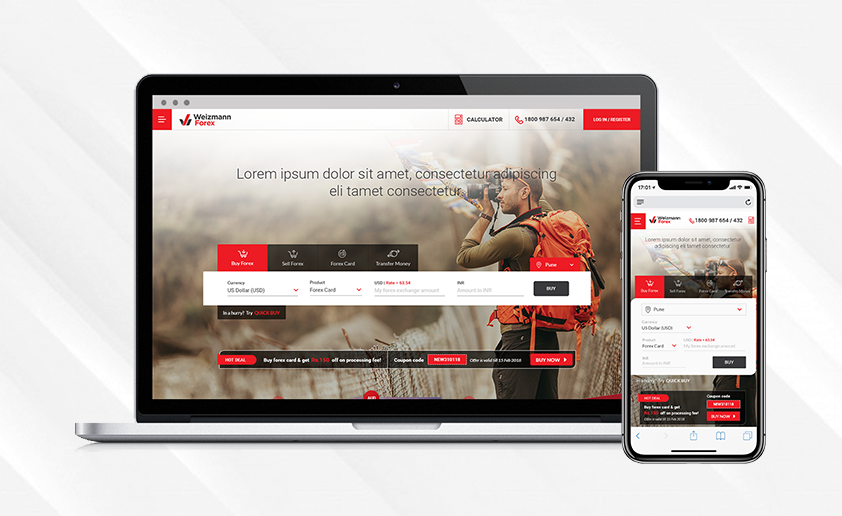
Forex and exchanges have tedious transactional flows, my intention was to give the users a streamlined and linear experience which is easy to use. The main aim of revamping the Foreign exchange website was to make it mobile-friendly and suit the needs of the millennials.
Earlier, Weizmann Forex was a website which was just informative and the users were directed to another URL, Doorstep Forex for the transactional bit. The rate of dropouts were really high because it seemed like a phishing website due to two different URLs

PROJECT PLANNING AND PROCESSES
After some compelling insights from the User Study and Competitive Research, the design process began leading up to the Visual mock-ups right from the Wireframes.
USER RESEARCH + COMPETITOR STUDY
I started by conducting interviews, competitive research and heuristic evaluations which translated into insights to create a framework for a better understanding of market ecosystem and understand the users.
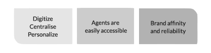
Users with two preferences were found:
Online - Users who prefer to buy forex online and are more inclined towards the digitized way of shopping
Via Agent - Users who prefer to buy forex through a personal agent as there is money involved
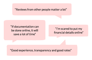
OBSERVATIONS + INSIGHTS
Everyone expects better rates, monitored service with minimum manual effort. Users tend to compare between companies and experiences across the platforms while expecting to track their orders, get real time status updates etc Brand affinity is the most valuable level of customer relationship. It breeds reliability and customer loyalty. Customers tend be loyal to a particular brand when there is money involved and with established brands, they expect more
Millennials mentioned preferring mobile apps over websites and physical office visits, where they could book, buy and keep track of all their orders, transactions and activities They also mentioned that a 24X7 available emergency hot-line with a good customer care service be it a chat-bot on the website or customer care call center, is very crucial especially when a customer relies on the brand reputation
WIREFRAMES
A linear flow with intuitive navigation has been made for all task flows of Buy, Sell, Forex card and Transfer Money. The other folds show how easy a transaction is , a ‘why choose us’ section, testimonials and a news section.

Landing page with all the 'Call-to-actions' in the first fold itself

The process, further simplified into 'Customer', 'Travel', and 'Delivery' details in an accordion style. Every step can be edited even after it has been filled and simultaneously gets auto-saved
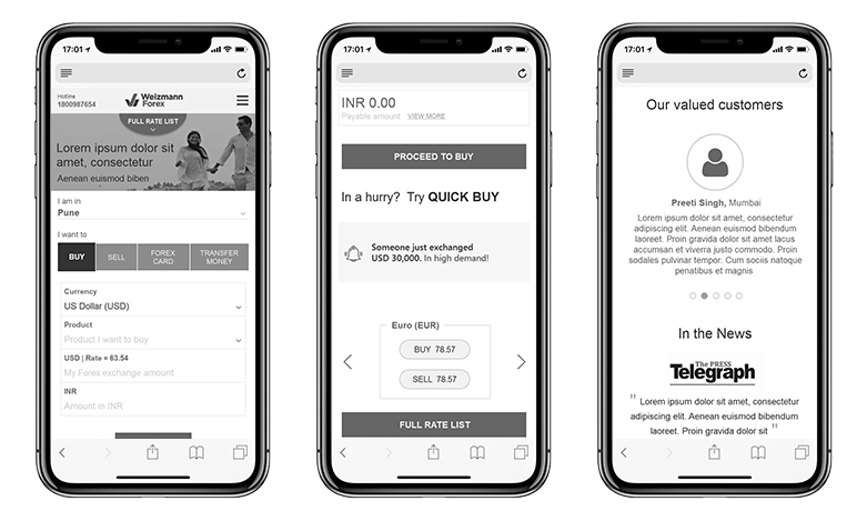
Responsive Design : The design was made for iPhone X but other devices can also easily accomodate all the important transactional information in the first fold
VISUAL MOCK-UP
Weizmann Forex didn’t have defined style or guidelines for visual elements apart from the brand colours so, working along with with a visual designer, the Visual language and Identity was set.
This project was worked on when I was a part of the Design Studio at Extentia Information Technology, Pune in collaboration with a Visual Designer and under the guidance of the Director of Design
Since the massive success of the project, Weizmann Forex has been overtaken by EbixCash